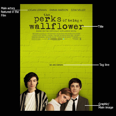
From the above two posters we can see that the main characters of the film have been featured on the Poster as well and have been kept in the fore front. These tell us about the conventions of the Film posters; leading actors are always kept under the highlight.
'Perks of Being A WallFlower's target audience is likely to be teenagers and therefore bright coolour has been used in the background, also possibly because the colour green is likely to represent nature, peace; renewal and growth, which accord with the story of the film as well.
As for 'Peole like us', subtle colours have been used and the poster itself is communicating with audience- it itself is speaking that the film is about family, love and being together.
The titles of both th films are large, bold, easily visible and crisp.
As for the two posters above, of 'On The Road' and 'The Way Back', they are VERY similar to each other. Almost kind of the same, I could say. The idea of dividing the poster into three separate sections and then showing the characters and the title within them, I believe is one very creative way of giving the audience an idea about the story.
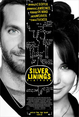
'Silver Linings Playbook' The film I had to wait for for so long to watch. Loved it!
Anyways, coming back to it's poster, loved that as well. Why? I think its one of the most creaive film posters that I have seen lately. It's not typical, in which I mean to say that it doesn't have the leading actor standing/sitting/posing for it with the title either on the top or below in simple font. Rather it has challenged the basic conventions of a film poster in a way that the title has been presented in sort of a mind map style. (At least that is what I figured out). And if you look closely, the similar-to-handwriting- font is telling the dialogues of both the characters from the film giving audience some insight into the characters just through the poster.
Conventions of a Film Poster
- Large and crisp title
- A tag line complimenting and giving further meaning to title
- Realease date of the film
- Image of the main actors featured in the Film; mostly used to attract the audience
- Name of the well known and main actors of the Film.
- Basic information i.e. Production house
From the analysis of these four posters above I now know, very clearly, what Mahnoor and I have to produce and what parts of the poster have to be given due significance. The main image and the how the film title has been presented matters a lot. I mean, to me, if the film title doesn't seem appealing and, on top of that, the image does not balance it our either, I might not prefer watching the film at all. Oh, and not to forget the colours of-course. The colours used, either for the font or the background would need to represent something, either relating to the character or the entire film itself, for the audience to perhaps get an idea of what the storyline of the film is.
The poster really needs to be as such that it compliments and connects with the film, can communicate with the audience and be a major selling point for the film, and for bringing in the audience to watch that film.


No comments:
Post a Comment