Wednesday 27 February 2013

Construction: Shoot#1


Well, today was thefirst shoot of our film and as frightened and nervous we were for carrying it out; it thankfully didn’t go that bad- in terms of difficulty, I mean of course.
We had decided to shoot Scene 1 and Scene 5 first since the location and actors were both present at school.  Beginning with scene 5, it involved a 180degree shot, so Mahnoor and I wanted both the actors to be there at the same time. Also because we believed that the presence of both actors for each other would help them act out their emotions and dialogues in a way that would seem real, perhaps.  However, unfortunately, this didn’t turn out to be possible because Hamza Khan, the actor playing our lead character, Ali Hamza Mahmood in his adult stage, was unable to make it on time. Therefore, since we did not have enough time due to permission issues for shooting in the office as, we had to being without him Sir Waqas.
The easy part of shooting this scene was that we had practiced the shot earlier with a few friends, therefore had a clear cut idea of what we had to do and how we had to shoot it. The main problem, however, was 
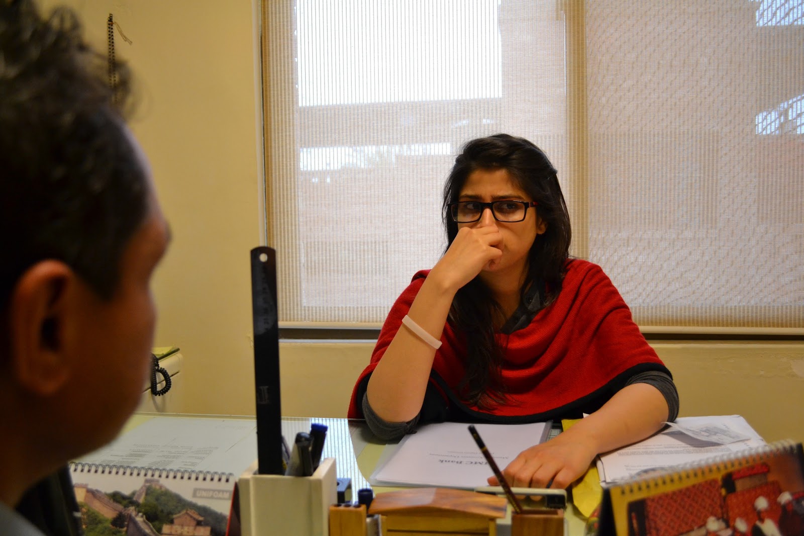
making Sir Waqas, playing the role of colleague, act out his scene. After countless times of taking turns to act out Ali Hamza’s dialogues with him, Mahnoor and I were finally able to get the correct shots with no mistakes in them. This is why we badly wanted for both the actors to be there! But, nonetheless, on the brighter side, Hamza was a pretty good actor; we directed him turn by turn for each shot and he did them perfectly in just the first take. Well, mostly.


Checking the placements for camera for 
180degree shot before the actors arrived


Office where the scene was shot. 
We taped a piece of chart paper on the monitor 
to reflect some light on protagonist's face.


As for shooting scene 1, it involved just one axial shot. Though technical, we were able to get it right in the second take since that too we had practiced earlier.
The next scene that we’ve planned to shoot now is Scene 4 since it involves a lot of technicalities and complexities; we therefore want to get done with it first.


Saturday 23 February 2013

Ancillary Task: Poster options

So Mahnoor and I sat together to discuss our ideas for the poster. My idea was to play around eyes since our film, in various shots would be focusing a lot on protagonist's eye and the story that is withing them. The story of our film revolves around a person who works hard to succeed in his life and we will showing three phases of his life in our film so I though maybe showing eyes could help us depict the different phase our character is in and also each picture of the eye would tell a different story enabling the audience to want to know what the film will be about. However at the same time, something that I did not realize while constructing the image of the poster in my head, was that this had chances to turn off the audience from the film as well. Because we would have been showing eye of three different people, audience may not be able to figure out what the film will be about or what the poster itself is trying to convey. This all resulted in no synergy between the film and the poster therefore we decided to drop this idea.

Mahnoor's idea was inspired by the cover page of the novel 'Kite Runner.'


What she wanted to show on the poster was the kid peeking from the wall with a pencil in his hand. In the cover, as it can be seen, the view is from the back of the child but Mahnoor wanted show it from the front so that our poster could communicate with the audience and give them a story to think about. I too felt that her idea was strong and that it related with our story really well.

After researching further the next idea we came up with was that we focus on just the face of our protagonist in the poster. The basic concept behind this idea was to show the two faces half and half from two different phases of our character's life
.
The problem arose when we had to decide which two phases of his life would be shown? Showing the childhood and adulthood seemed the most appropriate option because they were the two different poles of our character's life but then again, his youth, where he struggles the most, was equally significant too. After the extended debate on which two faces to show, we decided to drop this idea since it did not seem appropriate either way. 


We have decided to work further on Mahnoor's idea because out of the three that we discussed her's seemed to reflect our story really well. 

Wednesday 20 February 2013

Review Page Analysis

This review page is very different from the other ones that I have studied.  A landscape image is used from the film as the background which I feel is bringing life to entire look and feel of the two pages. Because the image is so glamorous  the rest of the page has been kept very simple in comparison so that it does not compete with the image. The page review has been written in four columns and at the end verdict is given by the write. Apart from that, beneath the title it says 'Chick flick with a bite' I think this is telling the audience about the genre of the film but rather in a very different way. Drop cap has been used for the starting the review and Director of the film and actors featured have also been mentioned here. 
This review page, as it can be seen, is continuity of another page therefore much cannot be said about it. Similar to the previous page, review has been written in columns and images have been taken from the film. The separate box says that the film is a witty adrenaline fueled blast from start to finish, therefore the stills taken from the film further make it easier for the readers to understand what the writer means. The images depict thrill and suspense. 


From analysis of the four review pages above i have concluded that the basic codes and conventions of a review page are as follows:
  • A large image from the film capturing the main actor
  • Details such as the director, main cast and release date.
  • Most important: Review is always written in columns so that it is easy to read since the font used is also very small. 
  • Rating of the film or verdict by the writer is also given
  • some part of the review, which is though to be the most appealing for the audience, is written in larger text separately and highlighted.


Poster Analysis; Ancillary Task


From the above two posters we can see that the main characters of the film have been featured on the Poster as well and have been kept in the fore front. These tell us about the conventions of the Film posters; leading actors are always kept under the highlight. 
'Perks of Being A WallFlower's target audience is likely to be teenagers and therefore bright coolour has been used in the background, also possibly because the colour green is likely to represent nature, peace; renewal and growth, which accord with the story of the film as well.
As for 'Peole like us', subtle colours have been used and the poster itself is communicating with audience- it itself is speaking that the film is about family, love and being together.
The titles of both th films are large, bold, easily visible and crisp.           
                    
As for the two posters above, of 'On The Road' and 'The Way Back', they are VERY similar to each other. Almost kind of the same, I could say. The idea of dividing the poster into three separate sections and then showing the characters and the title within them, I believe is  one very creative way of giving the audience an idea about the story.  
'Silver Linings Playbook' The film I had to wait for for so long to watch. Loved it!
Anyways, coming back to it's poster, loved that as well. Why? I think its one of the most creaive film posters that I have seen lately. It's not typical, in which I mean to say that it doesn't have the leading actor standing/sitting/posing for it with the title either on the top or below in simple font. Rather it has challenged the basic conventions of a film poster in a way that the title has been presented in sort of a mind map style. (At least that is what I figured out). And if you look closely, the similar-to-handwriting- font is telling the dialogues of both the characters from the film giving audience some insight into the characters just through the poster.


Conventions of a Film Poster
  • Large and crisp title
  • A tag line complimenting and giving further meaning to title 
  • Realease date of the film
  • Image of the main actors featured in the Film; mostly used to attract the audience
  • Name of the well known and main actors of the Film.
  • Basic information i.e. Production house


From the analysis of these four posters above I now know, very clearly, what Mahnoor and I have to produce and what parts of the poster have to be given due significance. The main image and the how the film title has been presented matters a lot. I mean, to me, if the film title doesn't seem appealing and, on top of that, the image does not balance it our either, I might not prefer watching the film at all. Oh, and not to forget the colours of-course. The colours used, either for the font or the background would need to represent something, either relating to the character or the entire film itself, for the audience to perhaps get an idea of what the storyline of the film is.
The poster really needs to be as such that it compliments and connects with the film, can communicate with the audience and be a major selling point  for the film, and for bringing in the audience to watch that film.


Sunday 17 February 2013

Planning: Cast list

Hamza Khan as Ali Hamza Mahmood(adult)

Aftab as Ali Hamza Mahmood(Kid)

Moeez as Ali Hamza Mahmood(youth)

Riffah as Ali Hamza's mother

Mahzeb as the rickshaw passenger

Waqas as Ali Hamza's colleague

Friday 15 February 2013

Planning: Shotlist

Scene
shot
Location
Description
Scene 1
1 Over the shoulder with axial cut
Office
Mr. Mahmood is sitting in his office, working, while one of the employees bring him a file to go through and sign.

2. Over the shoulder with axial cut
Examination Room
Ali is attempting his Matric Exam; the invidulator announces that the time is up. Ali turns to the first page to write his name.


Scene 2
1. Wide angle Medium long shot
Area where the kid lives
Ali (kid) is running from his home to the school.

 2.  Static camera. Front view of the kid running towards the camera.


 3. Mid long shot.
School
Ali is peeking from a wall nearby school.

 4. Long shot of the houses and the road where Ali is standing


 5. Macro shot of Ali’s eyes


 6. Wide angle Long shot


 7. Mid close up

Ali turns back and runs away.


Scene 3
1. Wide angle Long shot
Ali’s Home
Ali is cleaning his rickshaw

2. Close up


3. Long shot


 4. Mid long shot
Mr.Mahmood’s home


5. Mid shot


Scene 4
1.  Long shot
Road side
Woman walking towards the rickshaw

2. Medium shot
Office
Woman asks Ali to drop her home

3. Medim shot

Conversation of woman and ali

 4.Long shot

Back of the rickshaw, ali drives away


Scene 5
1 Mid shot

Mr.mahmood is working in his office

2 Mid Long shot

Colleague knocks and enters

3. Mid Shot (180degree)

Conversation between Mr. Mahmood and Ali

4. Close up with axial cut


Scene 6
1. Over the shoulder
Car
Flashback; scene 4


Scene 7
1. Long shot
Ali Hama’s house
Ali arrives from his office

2. Mid shot

Hamza gets off the car

3. Long shot

Ali’s house shown

4. Mid shot, camera pans

Ali walks towards his house

5. Over the shoulder (Ali)

Open the gate

6. Over the shoulder(Ali’s mother)


7. Macro shot of Ali’s eye

Ali looks and smiles at his mother