So Mahnoor and I sat together to discuss our ideas for the poster. My idea was to play around eyes since our film, in various shots would be focusing a lot on protagonist's eye and the story that is withing them. The story of our film revolves around a person who works hard to succeed in his life and we will showing three phases of his life in our film so I though maybe showing eyes could help us depict the different phase our character is in and also each picture of the eye would tell a different story enabling the audience to want to know what the film will be about. However at the same time, something that I did not realize while constructing the image of the poster in my head, was that this had chances to turn off the audience from the film as well. Because we would have been showing eye of three different people, audience may not be able to figure out what the film will be about or what the poster itself is trying to convey. This all resulted in no synergy between the film and the poster therefore we decided to drop this idea.
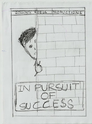
Mahnoor's idea was inspired by the cover page of the novel 'Kite Runner.'
After researching further the next idea we came up with was that we focus on just the face of our protagonist in the poster. The basic concept behind this idea was to show the two faces half and half from two different phases of our character's life.
The problem arose when we had to decide which two phases of his life would be shown? Showing the childhood and adulthood seemed the most appropriate option because they were the two different poles of our character's life but then again, his youth, where he struggles the most, was equally significant too. After the extended debate on which two faces to show, we decided to drop this idea since it did not seem appropriate either way.
We have decided to work further on Mahnoor's idea because out of the three that we discussed her's seemed to reflect our story really well.


No comments:
Post a Comment